Dropcaps
Once upon a time in a far away land all chapters began with these.
sile
Input document
\begin[papersize=a6]{document}
\nofolios
\use[module=packages.dropcaps]
\set[parameter=document.parskip,value=2bs]
\set[parameter=document.lskip,value=5en]
\set[parameter=document.rskip,value=5en]
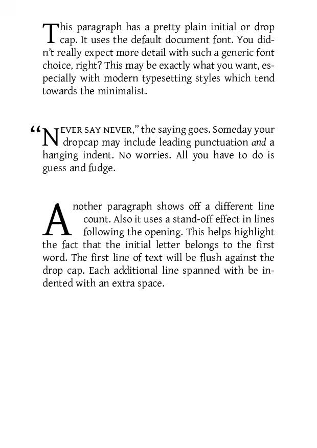
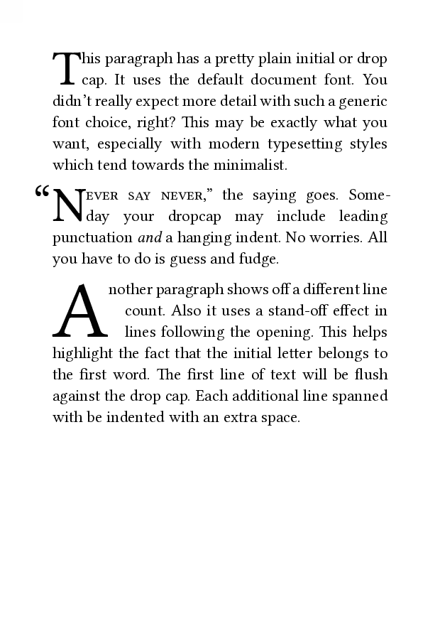
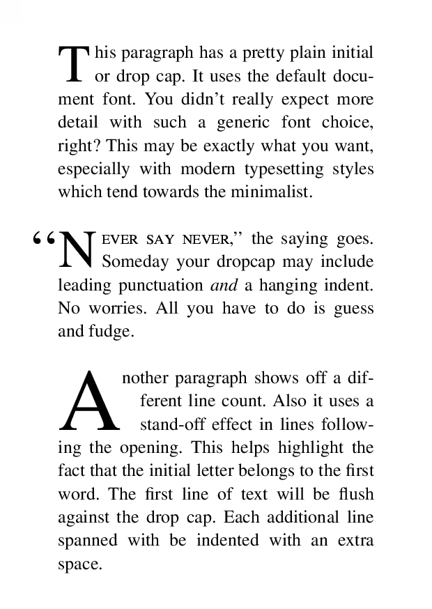
\dropcap[lines=2]{T}his paragraph has a pretty plain initial or drop cap.
It uses the default document font.
You didn’t really expect more detail with such a generic font choice, right?
This may be exactly what you want, especially with modern typesetting styles which tend towards the minimalist.
\dropcap[lines=2,join=true]{\kern[width=-0.9en]“N}\font[features=+smcp]{ever say never,}” the saying goes.
Someday your dropcap may include leading punctuation \em{and} a hanging indent.
No worries.
All you have to do is guess and fudge.
\dropcap[lines=3,join=true,standoff=1em]{A}nother paragraph shows off a different line count.
Also it uses a stand-off effect in lines following the opening.
This helps highlight the fact that the initial letter belongs to the first word.
The first line of text will be flush against the drop cap.
Each additional line spanned with be indented with an extra space.
\end{document}
Render command
$ sile -o dropcaps-sile.pdf dropcaps-sile.siltypst
Input document
#set page(
  paper: "a6",
)
#set par(
  justify: true,
)

#import "@preview/droplet:0.3.1": dropcap

#dropcap(
  justify: true,
  hanging-indent: 0pt,
)[
  This paragraph has a pretty plain initial or drop cap.
  It uses the default document font.
  You didn't really expect more detail with such a generic font choice, right?
  This may be exactly what you want, especially with modern typesetting styles which tend towards the minimalist.
]

#dropcap(
  justify: true,
  hanging-indent: 0pt,
  top-edge: "cap-height",
)[
  #place(dx: -0.4em, sym.quote.l)N
][
  #smallcaps[ever say never,]#sym.quote.r the saying goes.
  Someday your dropcap may include leading punctuation _and_ a hanging indent.
  No worries.
  All you have to do is guess and fudge.
]

#dropcap(
  height: 3,
  justify: true,
  hanging-indent: 1em,
)[
  Another paragraph shows off a different line count.
  Also it uses a stand-off effect in lines following the opening.
  This helps highlight the fact that the initial letter belongs to the first word.
  The first line of text will be flush against the drop cap.
  Each additional line spanned with be indented with an extra space.
]
Render command
$ typst compile dropcaps-typst.typ dropcaps-typst.pdfxelatex

Input document
\documentclass{article}
\usepackage[paperheight=148.5mm,paperwidth=105mm]{geometry}
\setlength{\parskip}{2\baselineskip}
\pagenumbering{gobble}
\usepackage{type1cm}
\usepackage{lettrine}
\begin{document}

\lettrine[nindent=0sp]{T}{}his paragraph has a pretty plain initial or drop cap.
It uses the default document font.
You didn't really expect more detail with such a generic font choice, right?
This may be exactly what you want, especially with modern typesetting styles which tend towards the minimalist.

\lettrine[lhang=.4,nindent=0sp]{``N}{ever say never,}'' the saying goes.
Someday your dropcap may include leading punctuation \textit{and} a hanging indent.
No worries.
All you have to do is guess and fudge.

\lettrine[lines=3,nindent=1em]{A}{}nother paragraph shows off a different line count.
Also it uses a stand-off effect in lines following the opening.
This helps highlight the fact that the initial letter belongs to the first word.
The first line of text will be flush against the drop cap.
Each additional line spanned with be indented with an extra space.
\end{document}
Render command
$ xelatex -interaction=batchmode -halt-on-error -jobname data/dropcaps-xelatex dropcaps-xelatex.texgroff
Input document
.PRINTSTYLE TYPESET
.PAGEWIDTH 297.675p
.PAGELENGTH 419.58p
.L_MARGIN 40p
.R_MARGIN 40p
.T_MARGIN 40p
.DROPCAP T 2
his paragraph has a pretty plain initial or drop cap.
It uses the default document font.
You didn't really expect more detail with such a generic font choice, right?
This may be exactly what you want, especially with modern typesetting styles which tend towards the minimalist.

.DROPCAP \*[FWD -.58m]``N 2
.SMALLCAPS
ever say never\c
.SMALLCAPS OFF
,'' the saying goes.
Someday your dropcap may include leading punctuation
.FT I
and
.FT R
a hanging indent.
No worries.
All you have to do is guess and fudge.

.DROPCAP_GUTTER 1m
.DROPCAP A 3
\*[FWD -1m]nother paragraph shows off a different line count.
Also it uses a stand-off effect in lines following the opening.
This helps highlight the fact that the initial letter belongs to the first word.
The first line of text will be flush against the drop cap.
Each additional line spanned with be indented with an extra space.
Render command
$ groff -mom -T pdf dropcaps-groff.mom > dropcaps-groff.pdf